


Creating a Stained Glass Pattern
Updated: Jul 6, 2025
To achieve success making a stained glass window, start with carefully creating a pattern with a well-planned design. The next step is to create the pattern. Finished sizes, space for lead or copper, and keeping organized are important.
Materials:
The design created on graph paper
Plain white paper
Card stock paper
Carbon paper
Tape, blue painter's tape is preferable
Colored pencil - red is my favorite color for this
Pattern Scissors
Envelopes
The card stock and plain papers should be as big as the pattern. If you have to piece together card stock, tape the paper together using one long strip of tape connecting the two pieces of card stock paper along the entire length of the edges that are joined. Don't use only a few smaller pieces of tape placed intermittently with gaps. When you cut out the pattern each pattern piece that is cut from more than one piece of paper needs to be held together along the entire length of where the separate pieces of card stock paper join together.
Create 3 copies (total) of your pattern
1. The original is on the graph paper.
**This is the "master” or the copy giving you the exact size of the finished window. When all of the glass pieces are cut out, the window panel is built on this graph paper. Lining up the border pieces on this graph paper at that step in the process, when you're building the window, enables you to be PRECISE.
2. A copy on plain paper.
** As you cut your glass glass lay the pieces on this copy to keep the organized and see what is completed, what is left to do. If your glass is organized as you cut the pieces it will be in order - you won't have a pile of glass pieces to assemble like a jigsaw puzzle later.
3. A copy made on card stock.
** This copy is cut with special pattern shears to give you pattern pieces.

Assemble the paper and carbon paper
Tape the card stock to your table surface using one piece of tape on each corner. If you've taped together smaller pieces of card stock to make one larger sheet of card stock, put the tape side down.
Place carbon paper on top of the card stock with the carbon side down.
Lay the plain paper on top of the carbon paper, taping the corners to the table.
Place another layer of carbon paper on top of the plain paper with the carbon side down.
Lay the pattern on top of the carbon paper, taping the corners to the table.
Trace and Label the Pattern
Using the red pencil, trace over every line in the pattern. Using a red pencil makes it very clear which lines you've traced and what is left to complete.
Label each piece with all the 3 pieces of information.
1. Number the pattern, giving each piece a number. The most efficient way to number pieces is to start in one corner and number down.
2. Label each pattern piece with a code to designate the glass used for that piece.
3. Label each pattern piece with a line, which can include arrows, to designate the grain. Glass that isn’t a flat, single color often has a pattern of swirls, lines, or other color variation markings. When cutting glass with markings it is important to have consistency of how those patterns flow through the overall design.

This illustration shows the graph paper copy. You can see the Fitting Line, the outer perimeter of the finished piece, and the Sight Size line. You have the line half way between these two lines, which is the size your glass needs to be.
The exterior border lines up between the Fitting Line and the Sight Size line on the graph paper when you assemble the window.
When you're duplicating the design on the cards stock, because you are creating pattern pieces, trace over the center perimeter line, the cutting line.

Follow this link to our blog post about sizing your window for more information on these perimeter lines.

Now look at the information on the pattern. Notice there is a notation on each pattern piece with all 3 items of information labeled: number, color, direction of grain. Of course if there is no grain on the glass used you don't need the notations for grain. Be sure to transfer all of this information onto the other two sheets - the plain paper copy and the pattern copy.
When you think you're done, do a quick scan of the design looking for red pencil over your original makrings to make sure you've transferred all of the information. Lift the tape from one corner, but leave most of the tape in place. Check your copies to make sure everything looks right before removing all of the tape.
Using Pattern Scissors`
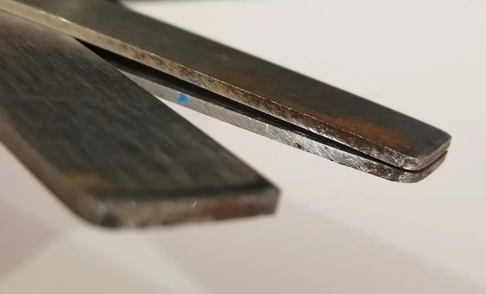
Cut the card stock into pattern pieces using pattern scissors. The pattern shears remove a channel, leaving a space for the lead or copper. The channel in the lead came takes up more space than the foil tape.
In this illustration of the cuts made
with pattern scissors, the wider space
is made with lead shears, the narrower
space is made with copper foil shears.

The stained glass pattern scissors have 3 blades enabling them to cut these channels but also making them a bit tricky to use.

I find it easiest to use the pattern shears by:
taking tiny little nips at the paper rather than making long cuts
keeping the shears open rather wide with the paper pulled into the fulcrum of the shears rather than keeping the paper at the tip
using the shears with the single blade at the top, cutting down into the paper, and the double blades at the bottom
Why is it important to use pattern shears?
It is extremely important to use pattern scissors specially made for working in stained glass to achieve the goal of using pattern pieces that are sized properly.
Imagine you are setting bricks. The bricks are sized differently. They all line up nicely when stacked close together. But you have to add the grout for the bricks, which is an analogy for the space the lead or copper foil takes. Once that grout is added, taking a bit of space between each brick, the space taken up by the bricks and grout is larger and the bricks don't fit together.

Organize the Pattern Pieces - and keep them organized!
As you are cutting out the pattern, sort and organize your pattern pieces according to color.
Put all the pattern pieces of each color in separate stacks as you cut.
Put each stack of like colored pattern pieces in a separate envelopes, one envelope dedicated to each color.
Put all of the envelopes into a large envelope that holds everything without bending any pieces.
Now you're ready to start cutting glass. Keep the pattern pieces together in their envelopes, sorted by color, and maintain their integrity and organization throughout the cutting process. You may need to refer to a pattern piece later when you’re assembling the window. Your pattern pieces will serve you best if they are in good repair and if you can find them.


https://gamebaidoithuong.capital/tai-xiu/ mình thấy bố cục ở đây nhìn ổn hơn mấy trang kiểu nhồi chữ với link loạn xạ, dù mình vẫn hơi dè chừng mấy bài “top 10” dạng này. Tiêu đề Top 10 Tài Xỉu tháng 9/2026 đặt ngay đầu nên khỏi phải đoán đang nói về cái gì, kéo xuống là nội dung chạy theo một mạch, đọc lướt cũng không bị lạc. Có đoạn họ nói về tiêu chí chọn trang uy tín, mình không đọc kỹ nhưng vẫn hiểu họ đang nhấn vào mấy điểm cơ bản để người xem tự cân nhắc, không phải kiểu kể lể dài dòng. Chữ không dày quá. Khoảng trắng với các khối nội dung chia ra vừa mắt…
SUNWIN là một trang mình vào thử và thấy bố cục khá rõ ràng ngay từ đầu. Mình chỉ lướt nhanh trang chủ để xem có dễ dùng không, chứ không ngồi tìm hiểu sâu. Các khối nội dung đặt gọn gàng, kéo xuống nhìn vẫn “đều mắt”, không bị rối hay nhảy lung tung. Menu để ở vị trí dễ nhận ra, bấm qua lại thấy ổn, nên muốn quay lại mục trước cũng nhanh. Mình thích kiểu trình bày này vì đỡ mất thời gian đoán chỗ cần xem. Trên phần nội dung chính có tiêu đề “Trang Chủ Chính Thức Không Bị Chặn… 2026” đặt khá nổi, nhìn là biết đang đúng trang và đúng chủ đề.
https://fly88.select/ hôm nay mình có ghé qua xem thử cho biết thôi, kiểu lướt nhanh chứ không đào sâu gì cả. Ấn tượng đầu tiên là trang sắp xếp khá gọn, mấy khối nội dung chia thành ô nhìn tách bạch nên mắt không bị loạn, kéo xuống vẫn theo kịp nhịp. Mình vốn hay ngại mấy site dạng này vì dễ bị nhét nhiều thứ, nhưng ở đây phần điều hướng đặt ngay chỗ dễ thấy nên chuyển qua lại không phải đoán (đỡ mất thời gian thật). Mình chỉ ngó qua vài mục để xem cách họ trình bày thông tin, thấy mấy bảng dạng cột xếp thẳng hàng nên đọc lướt vẫn nắm được ý nhanh. Nói…
https://ae888.cat/ hôm trước mình lướt thấy nên bấm vào nghía thử cho biết, kiểu tò mò xem họ làm web ra sao thôi. Vào cái là thấy giao diện chia khối khá gọn, tiêu đề đặt rõ ràng nên kéo xuống không bị rối mắt. Mình không đọc hết nội dung, nhưng có để ý họ nhắc nền tảng dùng được cả trên web lẫn điện thoại (Android/iOS), nên thử mở trên màn hình nhỏ thì bố cục vẫn ổn, chữ không bị dồn và các mục co lại vừa vặn. Thanh menu cũng nằm chỗ dễ thấy, bấm qua lại mấy phần không bị lag hay nhảy lung tung. Nói chung cảm giác là họ sắp xếp thông tin…
https://kubet.latino/ ừ thì mình cũng kiểu lướt cho biết thôi. Hôm qua đang rảnh tay mình vào thử, tưởng sẽ loằng ngoằng như mấy trang cùng kiểu mà hóa ra bố cục lại dễ nhìn hơn mình nghĩ; kéo xuống là thấy các khối nội dung đặt rõ ràng, tiêu đề to nên mắt bắt được ngay mình đang đọc phần gì, không cần phải bấm qua lại nhiều mới hiểu. Mình để ý họ có nhắc kho trò chơi hơn 150 cái, và cách trình bày theo từng sảnh nhìn phát là phân biệt được, kiểu mình chỉ xem lướt cũng hình dung được chỗ nào là game bài hay mấy mục giải trí khác, đỡ mất công mò.…